Considerations for accessorizing your home
“The details are not the details. They make the design.” – Charles Eames
The most interesting spaces are comprised of multiple layers, and the final finishing layer is art and accessories. We’ve learned a few lessons as our work has grown and changed over the years, here are two lessons we have taken to heart.
PROPORTION IS GOLDEN
Understanding scale and proportion is essential to creating a sense of cohesion and balance within any space. You might remember “The Golden Ratio” from your geometry and art history days. This concept was popularized in the early 1500’s when mathematician Luca Pacioli and artist Leonardo da Vinci collaborated on a book De Divina Proportione which espoused upon the beauty and orderliness manifest by the mathematical ratio related to Phi (ϕ). These composition principles show up frequently in nature, art, and architecture, and it is widely believed that the ratio of 1:1.6 yields a visually pleasing composition.
We all have some innate ability to recognize a balanced composition, but a tool like the Golden Rectangle can be extremely useful to get you started and to get you unstuck when you can’t quite figure out what an installation needs. The golden rectangle is a shape wherein a square drawn inside the original rectangle will net a remnant that is equal to the proportion of the original rectangle. Geometrically this looks like:
(sometimes you just need a little
geometry to guide you!)
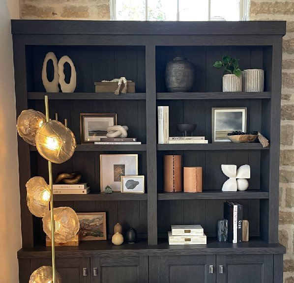
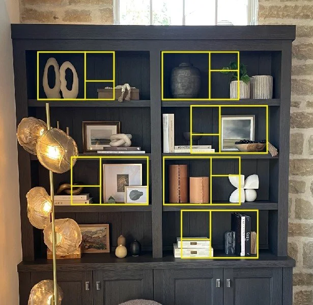
So how do we apply this concept to accessorizing? Let’s take this bookcase below as an example. The shelves are not perfect Golden Rectangles, but we are applying some of the compositional principles, primarily “The Rule of Thirds” within each shelf to create a sense of balance.
When we have a tall object occupying one side of the shelf, the balance of the shelf should only be filled with objects that occupy 1/3 or 2/3s of the space. Furthermore, we often find ourselves creating object groupings in quantities drawn from Fibonacci’s Sequence: 1, 1, 2, 3, 5. As interior designers, we aren’t generally revered as math whizzes, but these principles are helpful tools for creating a sense of harmony in our projects.
CRAFT HAS SOUL
As William Morris, one of the founding fathers of the 19th century Arts & Crafts movement said, “Have nothing in your houses that you do not know to be useful or believe to be beautiful.” Morris was a fierce advocate for artisans and craftspeople. He preached the gospel of handmade goods, and railed against the growing pervasiveness of industrialization. And while Morris’ battle against mass-production may have ultimately been lost, craftsmanship has always possessed the transformative capacity to infuse our spaces with soulfulness.
This ineffable quality that we call “soulfulness” is often reflected in the passage of time, the building of a collection, and the development of patina. In this spirit, a wise friend and colleague once shared that you can't photograph projects immediately after an install because they just, "aren't juicy yet." In other words: spaces have to ripen over time. It's the living, the layering, and the loving that goes into a home that adds depth and richness. The mark of use is uniquely personal, and it's the magic that makes a room juicy. (And as one witty commenter noted, “I love this idea! It explains my situation. I’m over ripe! Way past juicy!”)
Incorporating handmade objects, sentimental items, and vintage elements into a space truly facilitates meaningful place-making.


